portfolio | Lucky Creative
3
archive,category,category-portfolio,category-3,ajax_fade,page_not_loaded,,vertical_menu_enabled,side_area_uncovered_from_content,qode-child-theme-ver-1.0.0,qode-theme-ver-13.5,qode-theme-bridge,disabled_footer_top,wpb-js-composer js-comp-ver-6.9.0,vc_responsive

portfolio

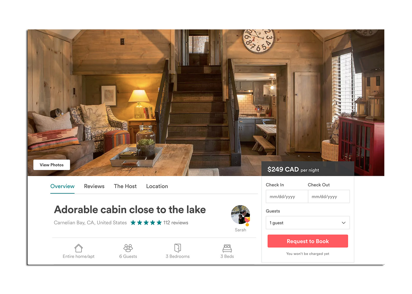
It’s hard for small businesses to take the plunge and hire a designer in an age of DIY. Why should you invest in a professional website design when you can assemble one with the Web Builder from GoDaddy? There is certainly a pain threshold that a new business has to cross before they are faced with the fact that they need a professional to help with their marketing. A confusing website, a clunky logo, a mismatched marketing and advertising campaign – the mixed messages add up until a consumer turns away before hearing a word you say. Paying for professional design services can do more than get your foot in the door.

Design helps small businesses in everything from inspiring confidence with a professional image, to setting your brand apart from the competition, to attracting like-minded employees and even building financial value.

Read more reasons why hiring a professional designer will add value to your business.

Having spent several years creating online Flash advertising, I’m well versed in Flash animation. During its hey day it took over the web and could rarely be avoided on a stroll through the internet. Now that HTML5 can use elements and scripts to recreate many of the wonders that Flash once provided Adobe has announced that the SWF will be forever gone as soon as 2020 rolls around.

Goodbye, my friend.

Read Flash and the Future of Interactive Content

The new logo for IBM iX – the design and consulting division of IBM – is rad. I use that term sparingly but they have truly earned it. I can see it on a new pair of skater sneaks or on an oversized pixel portrait. Maybe I’m smitten because I already love the band The XX, but you can really do no wrong with a mark that is so identifiable and engaging on black and white.

If I didn’t know it said ix from the very start it would probably take 2-3 guesses to get there but making the viewer work to decipher a glyph typically burns the image into memory.

With a solid foundation, you can certainly have a lot of fun with the variations…

It’s funny how much we naturally want to assimilate. Blame your subconscious if you want, but deep down in the back of your mind you want to be just like everybody else. Designers are supposed to innovate and come up with creative solutions but still fulfill that need to be accepted. Which is part of the reason that every website looks the same, and that’s ok. Website design is moving in a direction that is more homogenous but the end user is the one that reaps the rewards.

(more…)

One of the biggest obstacles I have found in designing logos is overcoming the theory that everyone and their mother should like a logo. If you are creating a mark for a new streaming music service that targets hipsters do you really want your mom to like the logo as much as you do? The design by committee approach has derailed many a design over the course of history, but it’s always interesting to see the process unfold even with a big brand. (more…)

College football is awesome, although it was particularly tough to see the Hawkeyes getting crushed in their bowl game this year. It wasn’t all that surprising, given that they had an ok record with a cupcake schedule. They were probably a bit overrated, but not as much as the SEC was for an entire season.

At the height of the overrated-ness when Ole’ Miss and Mississippi State were playing each other ESPN Gameday came to town and there was an outpouring of excitement and signage in the Gameday backdrop. One of those signs irked me:

Big-10

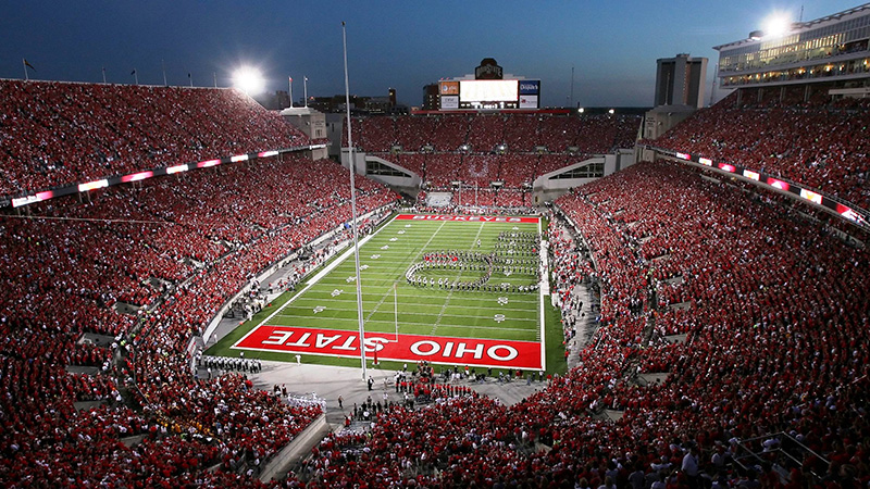
I probably watch too much ESPN and that’s where the talking heads preach SEC dominance (cough, SEC Network money machine, cough) and the seeds of Big Ten mediocrity are sown. I don’t blame this Mississippian for buying into the hype but I sure as hell wanted the Big Ten to ruin the SEC this year after that broadcast. Thank you to Ohio State, Michigan State and Wisconsin for crushing it. Big ups to the Big Twelve as well.

The SEC looked pretty shabby at the end of this season and I would trade a bad bowl game for my hawks in exchange for a trouncing of the SEC simply because it has to shift the perception that the SEC is almighty. Doesn’t it?

Wanna hear a joke?
Ole Miss fans are great with grammar – especially headlines.

It’s almost tradition for a dance party to break out at our house at 5pm on Fridays. It’s probably the best way to start a weekend and you can shake out the work week in ten minutes on your way to R&R.

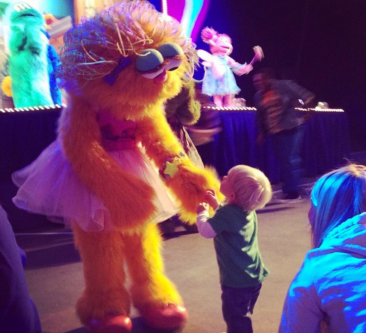
The other benefit is that your son can also rock some pretty incredible moves when he heads to Sesame Street Live. Is that a squat thrust?

“I learned it by watching you!”


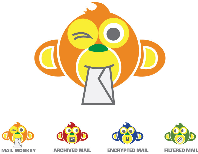
Sometimes it takes a long look at your collective work to notice themes. I think that the Mail Monkey logo for Aberdean hits a few of my common threads. Punchy colors(orange as a sub-theme), playful animals and block type seem to be my favorites. If you like the monkey, then you will love working with Clint Prescott.

PS – Mail Monkey is a great product. No more !!!Vi@Gr@!!! spam for me!


It’s time for a sandwich. Not just any sandwich, but one that is dripping with attention to detail and classic deli style. I hope that is not literal.

Making a ‘classic’ logo is pretty damn fun since I got to rummage through the internet for historical designs and found some absolute gems. In particular I found the Deli Garage which has a great collection of packaging design, especially the Kraftstoff flasks. If anyone was thinking of giving me a Christmas present please add these to the list.


Stalzy’s pulls from vintage delicatessen style, which is why I especially enjoy the avant garde font choices and the use of a star to break up the syllables for a phonetic spelling. Classic with class.

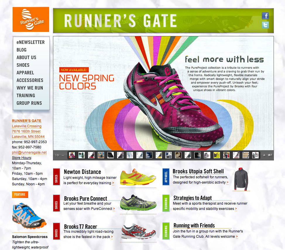
Runner’s Gate was a great client to work with and let me run wild with the design details. Humor is difficult to pull off in design because of vastly different opinions on what is funny. RG had a ‘why we run’ section that I paired with old yearbook photos and we both loved the end result. Love handles and beehives are funny. At least to us, anyway. If you’re in the Minneapolis area, buy your running shoes from Runner’s Gate.

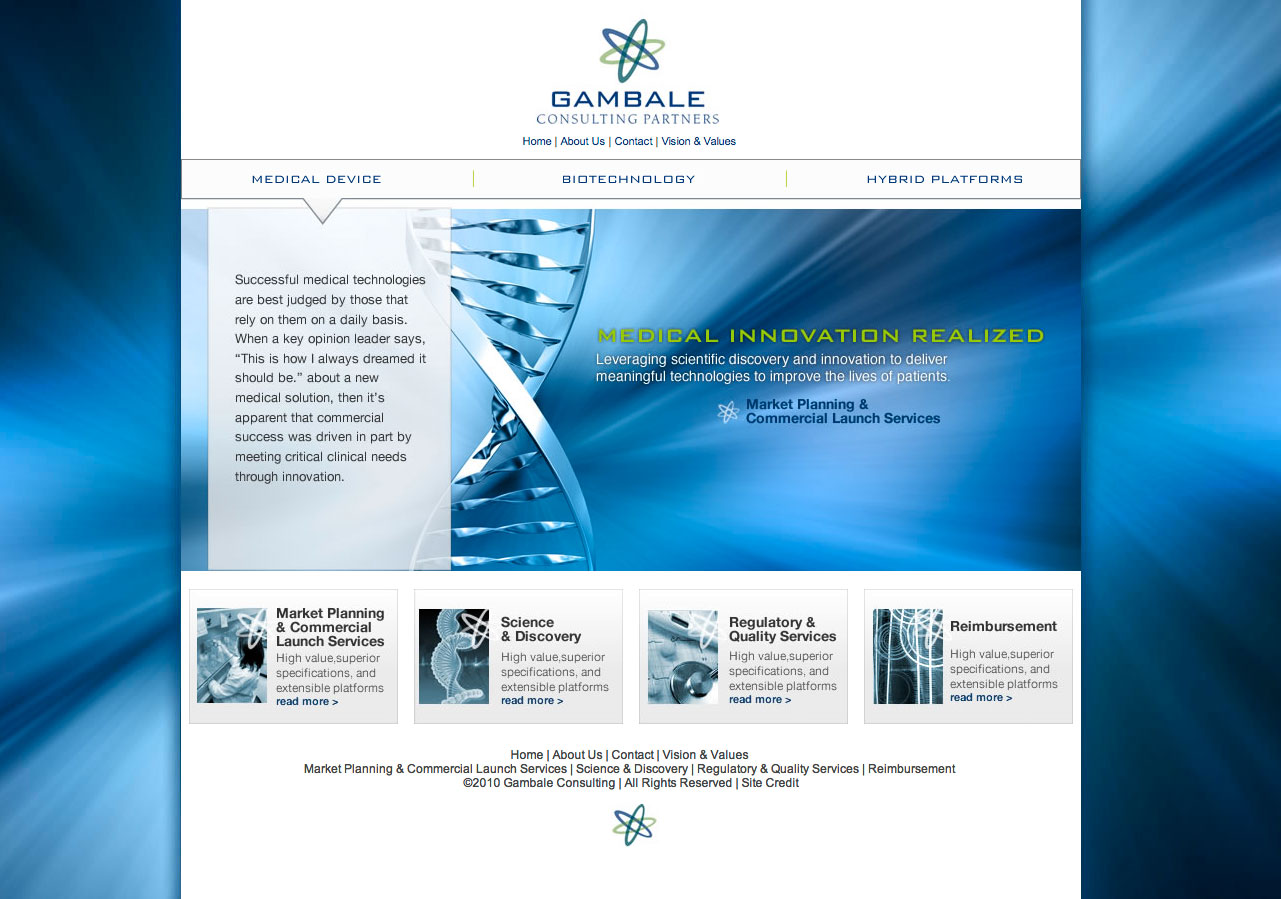
What does biotechnological medical device development involve? I don’t know. It’s a good thing that Gambale Consulting Partners know what they are doing because I don’t understand most of it.

It’s a little difficult to design a hierarchy of a website when you don’t understand half of the terms, but the homepage sets the tone for finding what you need if you do understand hybrid platform reimbursement. Services and product categories split the difference and the colors are incorporated from the logo. I also saw a promo for the new Tron movie and the colors are a little similar. Welcome to the future!