Logo Design | Lucky Creative
7
archive,category,category-logo-design,category-7,ajax_fade,page_not_loaded,,vertical_menu_enabled,side_area_uncovered_from_content,qode-child-theme-ver-1.0.0,qode-theme-ver-13.5,qode-theme-bridge,disabled_footer_top,wpb-js-composer js-comp-ver-6.9.0,vc_responsive

Logo Design

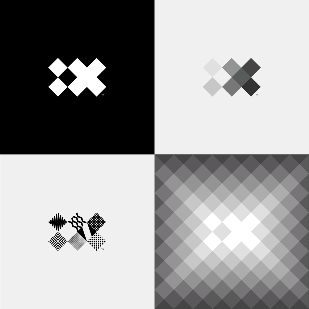
The new logo for IBM iX – the design and consulting division of IBM – is rad. I use that term sparingly but they have truly earned it. I can see it on a new pair of skater sneaks or on an oversized pixel portrait. Maybe I’m smitten because I already love the band The XX, but you can really do no wrong with a mark that is so identifiable and engaging on black and white.

If I didn’t know it said ix from the very start it would probably take 2-3 guesses to get there but making the viewer work to decipher a glyph typically burns the image into memory.

With a solid foundation, you can certainly have a lot of fun with the variations…
It’s funny how much we naturally want to assimilate. Blame your subconscious if you want, but deep down in the back of your mind you want to be just like everybody else. Designers are supposed to innovate and come up with creative solutions but still fulfill that need to be accepted. Which is part of the reason that every website looks the same, and that’s ok. Website design is moving in a direction that is more homogenous but the end user is the one that reaps the rewards.

(more…)

One of the biggest obstacles I have found in designing logos is overcoming the theory that everyone and their mother should like a logo. If you are creating a mark for a new streaming music service that targets hipsters do you really want your mom to like the logo as much as you do? The design by committee approach has derailed many a design over the course of history, but it’s always interesting to see the process unfold even with a big brand. (more…)


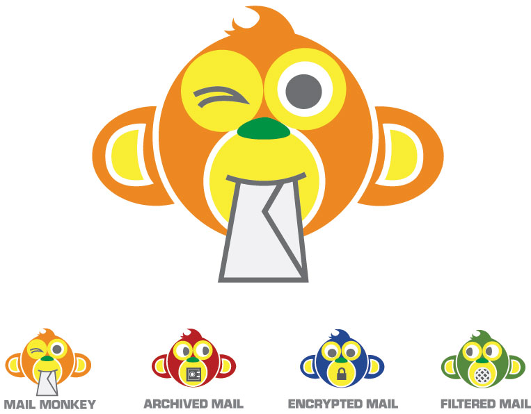
Sometimes it takes a long look at your collective work to notice themes. I think that the Mail Monkey logo for Aberdean hits a few of my common threads. Punchy colors(orange as a sub-theme), playful animals and block type seem to be my favorites. If you like the monkey, then you will love working with Clint Prescott.

PS – Mail Monkey is a great product. No more !!!Vi@Gr@!!! spam for me!


It’s time for a sandwich. Not just any sandwich, but one that is dripping with attention to detail and classic deli style. I hope that is not literal.

Making a ‘classic’ logo is pretty damn fun since I got to rummage through the internet for historical designs and found some absolute gems. In particular I found the Deli Garage which has a great collection of packaging design, especially the Kraftstoff flasks. If anyone was thinking of giving me a Christmas present please add these to the list.


Stalzy’s pulls from vintage delicatessen style, which is why I especially enjoy the avant garde font choices and the use of a star to break up the syllables for a phonetic spelling. Classic with class.