
03 Jan Pauliefest
THE BRIEF
Design a logo and T-shirt for the Pauliefest benefit.
THE RESULTS
Keeping the musical spirit in tact with a trendy type treatment and a dash of grunge. A perfect musician’s medley.


THE BRIEF
Design a logo and T-shirt for the Pauliefest benefit.
THE RESULTS
Keeping the musical spirit in tact with a trendy type treatment and a dash of grunge. A perfect musician’s medley.
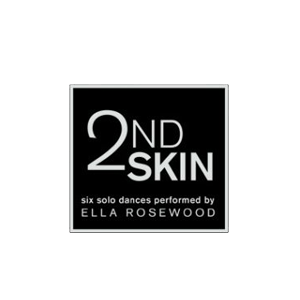
THE BRIEF
Design a logo, poster and postcard for the performance of 2nd Skin.
THE RESULTS
A medley of action shots juxtaposed over unwavering trees created a visual balance for the performance while piquing interest in the event. Modern dance has a lot of risk-taking and the design did the same.
THE BRIEF
Design a new advertising campaign to promote the Sandbox Children’s Museum. Present the space as a fun place for children to learn with grown-up appeal.
THE RESULTS
I used photography of children playing at the museum intertwined with some of my own imaginary illustrations to illuminate the scene. Each ad is dual purpose, highlighting an attraction within the museum and simultaneously promoting an upcoming event. Two birds, one stone and a series of advertisements that appeal to parents and kids alike.

THE BRIEF
Design a logo, website and marketing materials for a start-up salon in Madison, Wisconsin. Reflect the personality of the owner and keep things punchy.
THE RESULTS
Bright orange shears and a puffy, script font got the party started and now the staples of the design are integrated into all of the business advertising and marketing. Nothing says branding like a cohesive message and experience from start to finish.

THE BRIEF
They’re using real bullets! You need to understand a brief history of The 3 Amigos to place that line and a brief history of social media metrics to start hitting target markets. The logo design and website branding needed a pinch of modern and some punch of social media flavor.
THE RESULTS
Viola! Real Bullets and a logo/website combination that is sharp as tacks.

THE BRIEF
As self-proclaimed t-shirt design geeks, the Stalzy’s crew demands the best so that’s exactly what they get.
THE RESULTS
Tight t-shirts and one helluva brew ha ha. A promotional T that has enough swagger to be worn after the event provides some long term marketing.
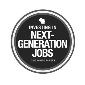
THE BRIEF
Knock out a white paper brimming with information from articles to graphics and make them all play nicely with each other. Keep the flow interesting and build the infographics in a way that is easy to understand and visually appealing.
THE RESULTS
One delightfully content-rich read that integrates the main points into highlights throughout the text. The cool color scheme and iconography blend the branding with the areas of focus.
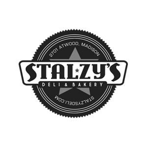
THE BRIEF
Design a logo, website and marketing materials for a non-traditional deli and bakery in Madison, Wisconsin with some traditional design elements. Anything that looks good on a t-shirt is preferred.
THE RESULTS
Fresh off the eastern bloq with some skater flair, the Stalzy’s logo keeps it traditional without being boring. The logo lends itself to modern design layouts and graphics and pairs nicely with the event posters and t-shirts.
A fresh take on a classic? That’s Stalzy’s to a T (shirt).